
I found myself applying this to Summer 2012's selection of anime. Amongst those that qualify as "mindless drivel", I found myself disliking three shows to the point of not bothering to care how they end (Campione!, Love and Election and Chocolate, Ebiten). All are chock-full of mindless plot lines and unnecessary sexual escapades, but I found myself ranking them in a manner that correlated to how bad their logo was.

Campione!, like its own logo, was incredibly difficult to view. If there is symbolism surrounding its "Pick-Up-Stix" design, I certainly can't see it. I mean, considering the show started in Italy, I haven't the foggiest idea why the exclamation point is stuck with a rose bloom. It's like the staff assumed France and Italy were the same country.
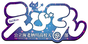
This brings us to Ebiten, a show so horribly disfigured by multiple personalities that it can't decide on an anime logo. I'd show you what they look like, but I don't want to be reminded that there's a train wreck like Ebiten out there. I'd be doing a disservice if I even showed the logos to people. (Out of mind, out of sight.) The manga's logo is relatively better, but a logo written solely in Sans Serif would look better.
So that got us thinking—which anime shows from this season have the best logos?
Before we rattle off which logos we felt rattled off the message the best, we noticed an interesting trend. It seems that a lot of the shows this season preferred introducing their logo in front of a common background. See if you can notice.


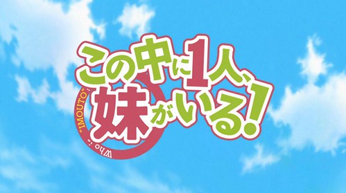
It seems that a lot of producers are figuring the logo is best before an azure blue sky. I'm not exactly sure if there is a psychological effect, but I suppose it beats putting it before an oozing screen of blood-red horror. I do have to give credit to NakaImo for sneaking the threatening "WHO IS IMOUTO?" subtext in their logo. It sure beats Dakara Boku wa H ga Dekinai's feeble attempt to sneak in as many "International Symbols for No" as possible into the design.
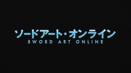
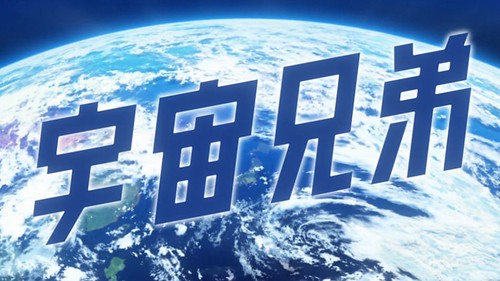
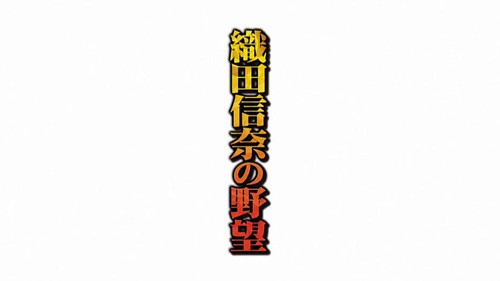
There are some logos (Sword Art Online, Space Brothers, The Ambition of Nobuna Oda) that also seem to enjoy using a very simple and straightforward approach. No bells and whistles, no frills, nothing but a corporate approach to the show. I do wonder about the last logo—I wonder if the writers of Nobuna Oda might have worked out a deal with the writers of Haruhi Suzumiya.
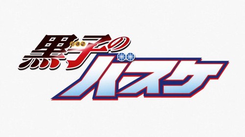
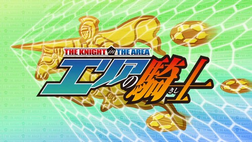
I also wonder if I'm the only one who thinks that Kuroko's Basketball and Knight in the Area share the same logo designer. Just me? Alrighty then.
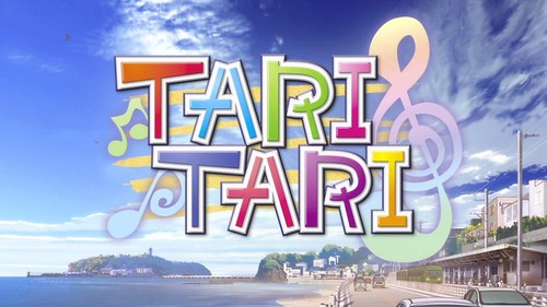
There are also some logos that I feel took an approach that was a little too creative. While Kids on the Slope incorporated musical notes into its logo, Tari Tari just feels like they threw a lot together at the last minute. I wouldn't say this was the worst logo of the season, but I think a serious makeover centainly wouldn't hurt.
Okay, okay. Enough overall criticism and a little more rankings. Here are the shows that I feel had the better logos this season.
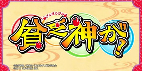
5. Binbôgami Ga!
I do think that the logo is a little haphazard in construction at first, but I like how the designer didn't go for the obvious and put the floating balls of flame on the marks for "ga", instead opting to put them in spots that people wouldn't expect. The sewn patch on the exclamation point does the trick for me in the end. If anything, Binbôgami Ga! has a logo that is more memorable than others.


3 (tie). Horizon on the Middle of Nowhere / Hunter X Hunter.
I'm putting these two together, since they both display a terrific sense of symmetry. While I stand behind my opinion that Horizon on the Middle of Nowhere is aimless with its exhorbitant display of bubble-gum breasts and crotch punches, I love the way the logo emphasizes the "horizon" concept, coupling it with a great black-white reflection of its main character. It feels weird seeing the English title flipped onto its head, but it catches the eye.
While I am also not much of a Hunter X Hunter fan (my reasons lie squarely with the manga and not the anime), I like the logo's test of the audience's mental cognisance. At times, I feel my mind's eye is tricked, and I sometimes see the "U" flipped into its correct position. This logo is another great display of symmetry coupled with the understanding that the "X" needs to be off-center for the logo to work.

2. Rinne no Lagrange
This may be more of a selection due to the eyecatch and less from the logo itself, but I like when colors relevant to a show are incorporated into the logo itself. The pastel colors of the robots in Lagrange are blended into the logo's design, while I also appreciate the thickness (and thinness) of the logo's fonts. A thinner kanji line coupled with a thicker katakana line really draws my attention more than shows that do the opposite.

1. Muv-Luv Alternative: Total Eclipse
I'm a bit surprised that I like Total Eclipse's logo the best out of all of this season's submissions, but again, I think part of it is the draw from the colors of the logo. The border-glow purple and burning orange placed over the shot of a lunar eclipse in the background fit in with the colors of the suits the operators wear (which may be a hint that the suite are way too emphatic or that the robots themselves are bland to the point of being forgotten). Then again, part of the reason might be due to the fact that the original logo for the Muv-Luv sim game looked like this:

Seriously, guys? Were you asleep or drunk when you designed this logo?
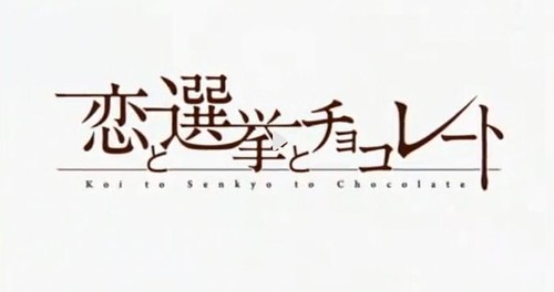
I'd say Koi Choco has by far the nicest logo. It's very chocolaty, but it's done so elegant and subtle with a minimal of changes to the kanji.
ReplyDeleteBesides the obvious chocolate drop at the end (which is still lowkey), the effect is entirely based on slightly elongated strokes and very subtle changes in the thickness.
I haven't seen any of the show, but the logo seems very romantic.
If you are taking the logo as it appears in the OP, there are storyboarding concerns to deal with as well. That's partly why so many of them have the sky as the background.
ReplyDelete